
Responsive Web Design Services: A Comprehensive Guide
Let's dive in to the world of responsive web design services! Have you ever encountered a website on your mobile device that required endless pinching and zooming to decipher its content? Or perhaps you've witnessed websites that shine on your laptop but crumble on your tablet. Fear not, for responsive web design is here to save the day! In this blog post, we will cover the topic of responsive web design, its significance, and how you can ensure your website truly embodies this important principle.
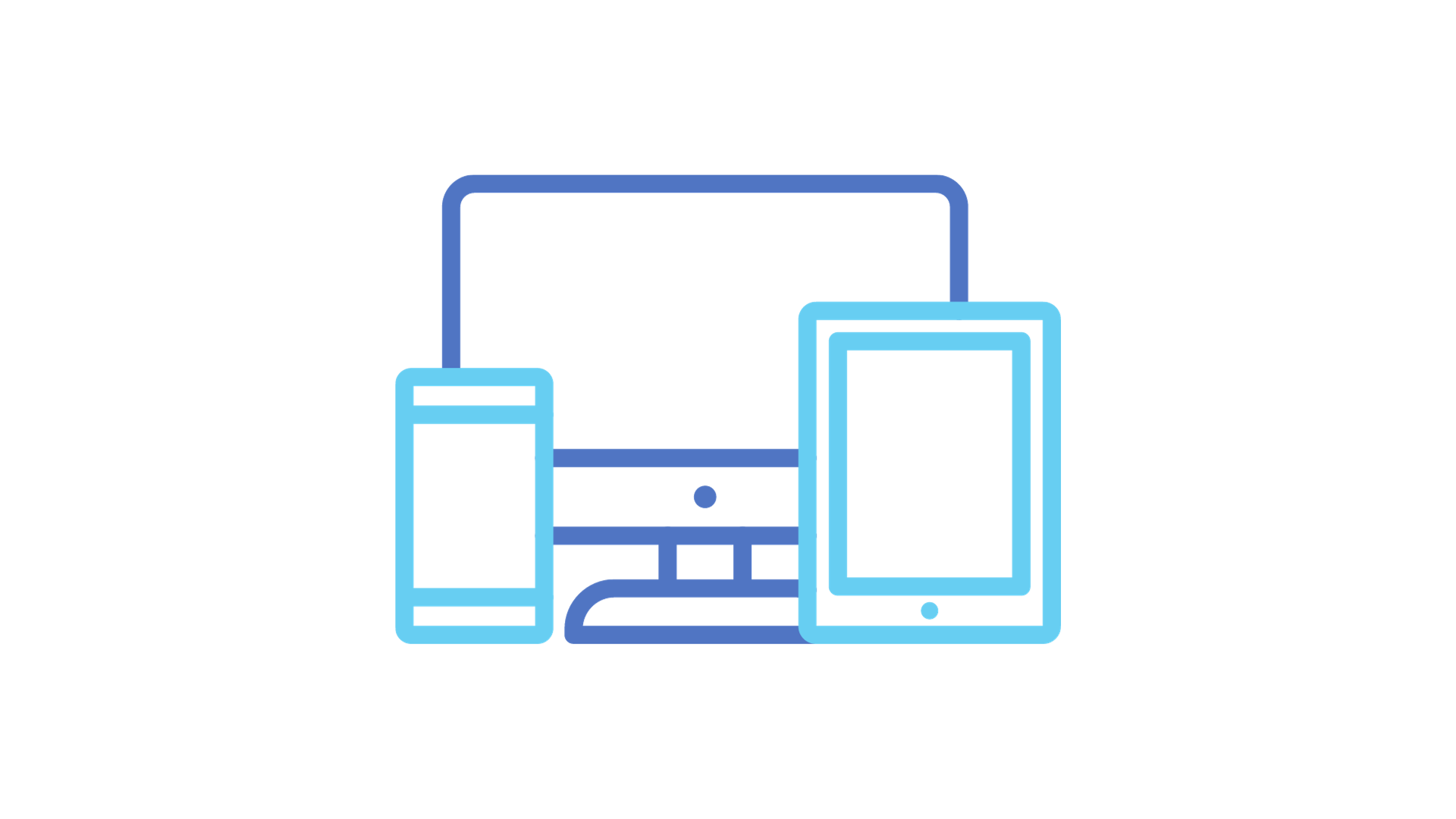
What is Responsive Web Design?
Responsive web design (RWD) is a design philosophy that seeks to harmonize web content, making it both visually appealing and functional across diverse devices and screen dimensions. Whether you're viewing a website on a desktop, laptop, tablet or smartphone, responsive design guarantees a consistent and smooth user experience.
The core tenets and components of responsive website development services encompass:
Fluid Grid Layout: Responsive websites employ relative units like percentages rather than fixed ones like pixels for layout and sizing. This enables content to adapt proportionally to the screen's width, creating a dynamic grid system. Elements such as images, text, and containers expand or contract in harmony with screen dimensions.
Flexible Images and Media: Images and media elements, including videos and embedded content, are crafted to be flexible, scaling seamlessly with varying screen sizes. This ensures images neither spill over their containers nor appear minuscule.
Media Queries: Media queries are CSS techniques empowering developers to apply distinct styles or rules based on device or viewport characteristics. For example, media queries can adjust font sizes, reveal or hide specific elements, or fine-tune layouts for specific screen widths.